
How to Choose the Right Paint Colour
🎨 Overwhelmed by colour choices? Here’s exactly how to pick the perfect paint colours for every room.
Standing in front of a paint fan deck with hundreds of colour options can be paralyzing. Should you go with warm neutrals or cool greys? Will that beautiful blue look the same on your walls as it does on the tiny swatch? And what about the light in Johannesburg versus Cape Town?
This comprehensive guide takes the guesswork out of choosing paint colours. We’ll cover colour psychology, undertones, LRV (Light Reflectance Value), how South African light affects colours, and room-by-room recommendations. Whether you’re in Sandton, Durban, or Stellenbosch, you’ll know exactly how to choose colours that work.
🎨 PRO TIP: Never choose a paint colour from a tiny swatch alone. Always test samples on your walls and observe them in different lights throughout the day. What looks perfect in the store can look completely different in your home.
Still unsure which colours to choose?
Get expert advice from professional painting contractors in your area – they’ll help you select the perfect colours and provide accurate quotes.
Servicing Johannesburg, Pretoria, Cape Town, Durban, and nationwide
📋 Table of Contents – Paint Colour Selection Guide
🧠 Colour Psychology – How Paint Colours Affect Mood
Colours aren’t just decorative – they affect how we feel, behave, and even how we perceive space. Understanding colour psychology helps you create rooms that function the way you need them to .
🔴 Warm Colours (Red, Orange, Yellow)
Stimulating, energetic, cosy. Red increases heart rate and appetite; orange promotes enthusiasm; yellow boosts happiness. Best for social spaces like living rooms and dining rooms.
🔵 Cool Colours (Blue, Green, Purple)
Calming, relaxing, serene. Blue lowers blood pressure; green reduces stress; purple promotes creativity. Perfect for bedrooms, bathrooms, and relaxation areas.
⚪ Neutrals (White, Grey, Beige, Taupe)
Versatile, timeless, grounding. Neutrals create a blank canvas that works with any décor style. They reflect light and make spaces feel larger.
🌿 Earth Tones (Terracotta, Olive, Brown)
Grounded, natural, warm. Earth tones connect us to nature and create cosy, inviting spaces. Particularly popular in South African homes for their natural feel.
Quick Reference – Colour Effects
- Red: Appetite stimulant, attention-grabbing – good for dining rooms
- Orange: Enthusiastic, social – good for exercise rooms, playrooms
- Yellow: Happy, optimistic – good for kitchens, breakfast nooks
- Green: Balanced, restful – good for bedrooms, living rooms
- Blue: Calming, serene – good for bedrooms, bathrooms
- Purple: Creative, luxurious – good for accent walls, creative spaces
- Pink: Soothing, nurturing – good for nurseries, girls’ rooms
- Grey: Sophisticated, neutral – good for modern spaces, offices
- Brown/Beige: Grounded, warm – good for living areas, family rooms
🎨 Understanding Undertones – Warm vs Cool
This is where most homeowners go wrong. Every colour has an undertone – a subtle hint of another colour beneath the main colour. Getting undertones wrong is why that “perfect grey” looks purple or green on your walls .
| Colour Family | Warm Undertones | Cool Undertones |
|---|---|---|
| White | Cream, yellow, peach, pink | Blue, grey, green |
| Grey | Brown, beige, taupe (“greige”) | Blue, green, purple |
| Beige | Yellow, orange, pink | Grey, green (rare) |
| Brown | Red, orange, yellow | Grey, green |
| Blue | Green (teal), purple (periwinkle) | Grey, true blue |
| Green | Yellow (lime), brown (olive) | Blue (mint), grey |
How to Identify Undertones
- Compare side-by-side: Place your colour sample next to pure white and pure black. This helps reveal the underlying hue.
- Check in natural light: Undertones become more visible in daylight. Hold samples against a white sheet of paper.
- Look at the darkest part of the swatch: On a colour card, the darkest shade often shows the undertone most clearly.
- Ask the paint specialist: At Dulux or Plascon stores, staff can help identify undertones.
Pro tip: If you’re unsure about undertones, stick with colours labelled “true” or “pure” – they have minimal undertones and are safer choices .
💡 LRV – Light Reflectance Value Explained
Light Reflectance Value (LRV) measures how much light a colour reflects – from 0% (absolute black, absorbs all light) to 100% (pure white, reflects all light). LRV dramatically affects how a colour appears in your space .
| LRV Range | Category | Effect | Best For |
|---|---|---|---|
| 80-100% | High (very light) | Maximises light, makes rooms feel larger | Small rooms, dark spaces, ceilings |
| 60-80% | Medium-High (light) | Bright, airy, reflects good light | Most living areas, hallways |
| 40-60% | Medium | Balanced, cosy without being dark | Bedrooms, dining rooms |
| 20-40% | Medium-Dark | Dramatic, intimate, absorbs light | Accent walls, home theatres |
| 0-20% | Dark | Very dramatic, moody, hides imperfections | Feature walls, exterior accents |
LRV and South African Light
- Highveld (Johannesburg, Pretoria): Intense sunlight means you can use darker colours (lower LRV) without making rooms feel cave-like. The strong light balances deeper hues.
- Cape Town: Overcast winter days mean you might want higher LRV colours to maximise light during grey months.
- Durban: Humid, bright conditions – colours appear more intense. You may need to go one shade lighter than you think.
☀️ How South African Light Affects Paint Colours
South Africa’s light is unique – intense, clear, and with specific characteristics depending on where you live. Here’s how it affects colour perception :
🏔️ Highveld Light
Characteristics: Intense, high UV, clear, crisp at altitude (1,500m+)
Effect on colour: Colours appear brighter, more saturated. Blues look bluer, reds look redder. Shadows are sharp.
Tip: You can go one shade darker than you think – the light will keep it feeling fresh.
🌊 Coastal Light
Characteristics: Diffused by moisture, softer, hazy at times
Effect on colour: Colours appear softer, more muted. Greys can look bluer, whites creamier.
Tip: Choose colours with stronger pigment – they’ll hold their intensity in the soft light.
🏜️ Inland Light
Characteristics: Harsh, dry, intense midday sun
Effect on colour: Colours can look washed out in direct sun, richer in shade.
Tip: Test colours in both direct sun and shade – they’ll look different.
🏙️ City Light
Characteristics: Mixed natural and artificial, reflected from buildings
Effect on colour: Complex – colours pick up reflections from surroundings.
Tip: Consider what’s outside your windows – green gardens, red brick, blue pools all affect perceived colour.
🏡 Room-by-Room Colour Guide
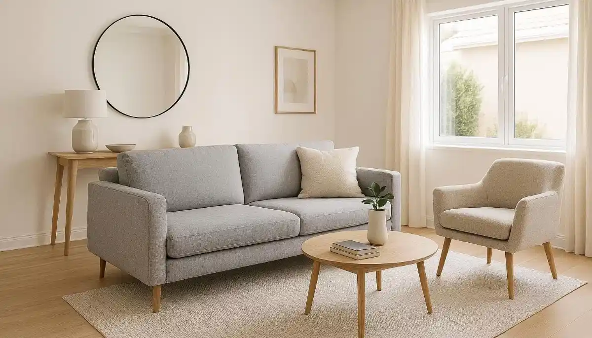
🛋️ Living Room Colours
The living room is your home’s social hub – it should be welcoming, comfortable, and adaptable.
- Best colours: Soft neutrals (beige, taupe, warm grey), earthy tones (terracotta, olive, muted green), warm whites
- Accent options: Navy, deep teal, charcoal, burnt orange
- Why they work: Neutrals create a flexible backdrop for furniture and art. Earthy tones add warmth and connection to nature. Accent walls add depth without overwhelming.
- LRV range: 50-75% for main walls; 20-40% for accents
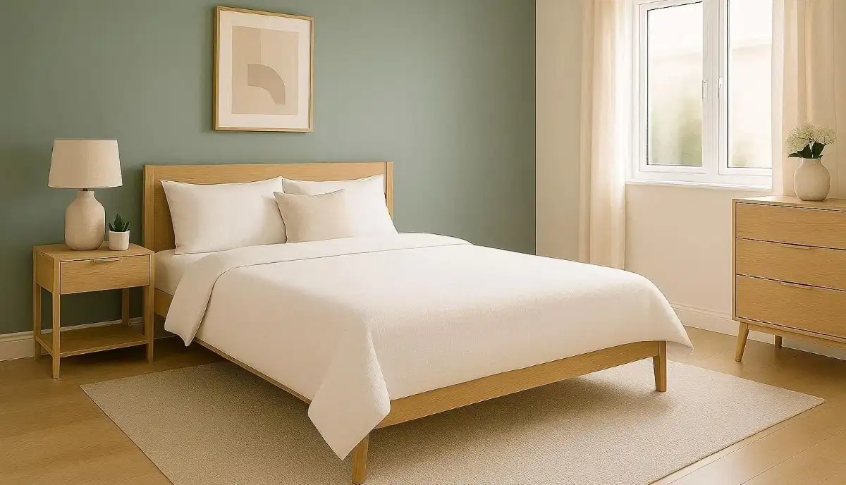
🛏️ Bedroom Colours
Bedrooms should promote rest, relaxation, and intimacy.
- Best colours: Cool tones (soft blue, lavender, sage green), muted neutrals (greige, blush, dusty rose), warm greys
- Why they work: Cool colours lower stress and promote relaxation. Muted neutrals create a cosy, cocoon-like feel. Avoid bright, stimulating colours in bedrooms.
- LRV range: 40-65% – enough light to feel airy, but soft enough for calm
🍳 Kitchen Colours
Kitchens need to feel clean, bright, and energetic – but also warm and welcoming.
- Best colours: Crisp whites, off-whites, light blues, mint greens, sunny yellows, warm greys
- Why they work: Light colours reflect light and make kitchens feel larger. Blues and greens promote calm while cooking. Yellows add energy for morning coffee.
- LRV range: 65-85% – keep it bright and reflective
🚿 Bathroom Colours
Bathrooms should feel clean, fresh, and spa-like – but also handle humidity well.
- Best colours: Light greys, whites, soft blues, seafoam green, pale aqua, warm beiges
- Why they work: Light colours enhance the clean feel. Blues and greens create a spa-like atmosphere. Always use bathroom-specific paint with mildewcides.
- LRV range: 70-85% – maximise light in often windowless spaces
💻 Home Office Colours
With more South Africans working from home, office colours matter for productivity.
- Best colours: Cool greys, soft blues, muted greens, warm neutrals
- Why they work: Blues boost focus and calm. Greens reduce eye strain. Greys are professional and distraction-free. Avoid bright yellows (too stimulating) and dark colours (too draining).
- LRV range: 50-70% – balanced, not too bright or too dark
🧸 Kids’ Rooms
Children’s rooms need to evolve with them – and handle wear and tear.
- Infants: Soft pastels (pink, blue, mint, lavender) – calming, gentle
- Toddlers: Bright primaries (in moderation) – stimulating, fun (use on accent walls)
- Teens: Muted tones, deeper colours (charcoal, navy, sage) – sophisticated, adaptable
- LRV range: Varies by age – infants: 60-75%; teens: 30-60%
- Always use zero-VOC paint in children’s rooms for health .
🏠 Exterior Colour Selection
Choosing exterior colours is different from interior – you’re dealing with fixed elements (roof, paving, garden) that you can’t change .
Key Principles
- Consider fixed elements: Your roof colour, paving, and garden are permanent. Choose wall colours that complement them.
- Neighbourhood context: Your house should fit with the street – especially important in estates and complexes.
- Climate considerations: Light colours reflect heat (good for hot areas), dark colours absorb heat (good for cool areas).
- Architectural style: Different styles suit different palettes – Cape Dutch, modern, Tuscan, etc.
| Architectural Style | Recommended Colour Palette | Examples |
|---|---|---|
| Cape Dutch / Heritage | Whites, cream, soft yellows, dark green trim | Cape Town, Stellenbosch, Franschhoek |
| Tuscan / Mediterranean | Terracotta, ochre, warm beige, dark brown trim | Johannesburg, Pretoria, estate homes |
| Modern / Contemporary | Grey, charcoal, white, black accents | Sandton, Fourways, Umhlanga |
| Coastal / Beach | White, light blue, seafoam, sandy beige | Cape Town, Durban, Ballito, Umhlanga |
| Country / Farmhouse | Olive, sage, brown, cream | Hartbeespoort, Magaliesburg, wine farms |
🌊 Coastal Colour Palettes
For homes in Cape Town, Durban, Umhlanga, and Ballito, coastal colours reflect the natural environment :
🎨 Popular Coastal Colours
- Beach white – crisp, clean, reflects heat
- Seafoam green – soft, calming, coastal vibe
- Aqua blue – fresh, ocean-inspired
- Sandy beige – warm, natural, blends with sand
- Driftwood grey – weathered, sophisticated
- Navy blue – bold accent, contrasts with white
⚠️ Coastal Considerations
- Light colours reflect harsh coastal sun
- Paler shades show less salt residue
- Use marine-grade paint for longevity
- Test colours in coastal light – they’ll look different
- Consider mould-resistant formulations
⛰️ Highveld Colour Palettes
For Johannesburg, Pretoria, Midrand, and Centurion, the Highveld light and landscape inspire different palettes :
🎨 Popular Highveld Colours
- Warm grey – versatile, modern
- Terracotta – earthy, connects to landscape
- Olive green – natural, calming
- Ochre yellow – warm, African sun-inspired
- Charcoal – dramatic accent, hides dust
- Soft white – classic, reflects intense light
⚠️ Highveld Considerations
- UV-resistant paint essential – sun is intense
- Lighter colours reflect heat (good for summer)
- Dust shows more on dark colours
- Test colours in both sun and shade – contrast is sharp
- Consider thermal expansion – flexible paints needed
⚪ Neutral Colours – The Safe Choice
Neutrals are popular for good reason – they’re versatile, timeless, and work with any décor. But not all neutrals are created equal .
| Neutral Type | Undertone | Best For | Popular SA Colours |
|---|---|---|---|
| Warm White | Cream, yellow | Traditional homes, cosy spaces | Plascon Rice Paper, Dulux China White |
| Cool White | Blue, grey | Modern homes, crisp look | Plascon White Frost, Dulux Lexicon |
| Greige | Grey + beige | Versatile, modern neutral | Plascon Greige, Dulux Natural White |
| Taupe | Brown + grey | Warm, sophisticated | Plascon Taupe, Dulux Pebble |
| Warm Grey | Brown undertone | Cosy modern spaces | Plascon Concrete, Dulux Grey Matters |
| Cool Grey | Blue/green undertone | Clean, contemporary | Plascon Silver, Dulux Grey Squirrel |
🎨 Accent Walls – Rules & Ideas
Accent walls add depth and interest without overwhelming a room. Here’s how to get them right :
The Rules
- Choose the right wall: The accent wall should be the focal point – often the wall behind the bed, sofa, or fireplace.
- Consider proportion: Accent walls work best in rooms that aren’t too small – a tiny room with a dark accent wall can feel cramped.
- Colour relationship: Your accent colour should relate to the main wall colour – either complementary or deeper version of the same hue.
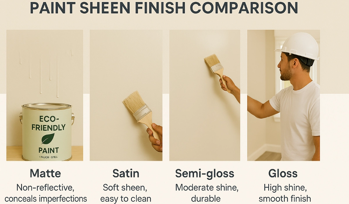
- Sheen matters: Using a different sheen (e.g., satin accent on matt walls) can create subtle interest without colour change.
- One is enough: Multiple accent walls in one room usually fight for attention – stick to one.
Accent Wall Ideas
- Bedroom: Navy blue behind bed, charcoal in modern rooms, blush pink in feminine spaces
- Living room: Deep teal behind sofa, burnt orange for warmth, forest green for drama
- Dining room: Rich burgundy, charcoal, or deep gold – creates intimate dining atmosphere
- Home office: Soft blue for focus, green for calm, grey for professionalism
- Kids’ rooms: Bright colour or mural wall – fun without overwhelming entire room
🧪 How to Test Paint Colours Properly
Never choose a colour from a tiny swatch alone. Follow this testing process :
- Buy sample pots: Spend the R50-100 per sample – it’s the best money you’ll spend on your paint job.
- Paint large samples: Paint at least A4-sized patches (bigger is better) on multiple walls – colours look different on different walls due to light.
- Observe at different times: Check the samples in morning light, midday sun, afternoon glow, and evening artificial light.
- Live with them: Leave samples up for a few days. Look at them when you’re relaxed, when you’re tired, in different moods.
- Compare to furnishings: Hold fabrics, cushions, and artwork against the samples to ensure they work together.
- Check undertones: Compare samples to pure white – this reveals undertones clearly.
- Consider primer: Test over primer if your walls are dark or stained – the base affects the final colour.
Pro tip: Paint sample patches on white cardboard or foam board. You can then move them around the room to see how the colour looks in different spots – much easier than painting multiple walls .
📈 Trending Colours in South Africa
South African colour trends reflect our unique light, landscape, and lifestyle. Current favourites include :
🌿 Earthy Neutrals
- Terracotta
- Ochre
- Warm beige
- Clay
- Sandy tones
Popular in Johannesburg and Pretoria – connect to African landscape
🌊 Coastal Blues & Greens
- Sage green
- Olive
- Forest green
- Coastal blue
- Aqua
⚫ Bold Accents
- Navy
- Charcoal
- Deep teal
- Burgundy
Used as feature walls in modern homes across all regions
⚪ Crisp Whites
- Pure white
- Off-white
- Cream
Timeless favourite for ceilings, trim, and modern interiors
Dulux and Plascon release annual Colour of the Year and trend forecasts – check their websites for the latest inspiration .
❌ 10 Common Colour Selection Mistakes
- Choosing from tiny swatches: That 2cm² square tells you nothing about how the colour will look on 20m² of wall. Always test large samples .
- Ignoring undertones: That “perfect grey” that looks purple on your walls? You didn’t check the undertone. Always compare to pure white .
- Forgetting about light: Colours look completely different in north-facing vs south-facing rooms. Test in your actual light conditions .
- Matching exactly to furnishings: Your walls should complement, not match, your sofa. Go lighter or darker for depth .
- Following trends blindly: That trendy colour might not suit your home, your light, or your lifestyle. Choose what works for you .
- Not considering fixed elements: That beautiful blue might clash with your orange tile floor. Work with what you can’t change .
- Using the same colour throughout: Different rooms need different feels. A cohesive palette with variations works better than one colour everywhere .
- Choosing colour before furniture: Paint is easier to change than furniture. Choose your larger investments first, then paint to complement .
- Ignoring the 60-30-10 rule: 60% dominant colour (walls), 30% secondary (furniture), 10% accent (art, cushions). Creates balanced spaces .
- Rushing the decision: Paint colours last 5-10 years. Take time to test and live with samples before committing .
Still Stuck on Colour Choice?
Professional painting contractors can offer expert colour advice based on your space, light, and style preferences. Get free quotes from local experts.
Serving Johannesburg, Pretoria, Cape Town, Durban, and nationwide
❓ Frequently Asked Questions
How do I choose the right paint colour for my room?
Start with the room’s function and desired mood. Consider natural light, room size, and fixed elements. Test large samples on multiple walls and observe at different times of day. Use the 60-30-10 rule for balanced colour schemes .
What are undertones and why do they matter?
Undertones are subtle hints of other colours beneath the main colour. They matter because they affect how colours look next to each other and in different lights. A grey with blue undertone looks different from a grey with brown undertone .
How does South African light affect paint colours?
Highveld light (intense, high UV) makes colours appear brighter and more saturated. Coastal light (diffused, hazy) softens colours. Always test colours in your specific light conditions. What works in Johannesburg may not work in Cape Town .
What’s the best white paint colour?
The “best” white depends on your light and style. Warm whites (cream undertones) suit traditional homes and create cosy spaces. Cool whites (blue/grey undertones) suit modern homes and create crisp, clean looks. Test several whites in your space .
Should I paint all rooms the same colour?
Not necessarily. A cohesive colour palette with variations works better – different shades of related colours create flow while giving each room its own feel. Open-plan spaces often work best with one main colour throughout .
How do I choose exterior paint colours?
Consider fixed elements (roof, paving, garden), neighbourhood context, and climate. Light colours reflect heat (good for hot areas). Dark colours absorb heat (good for cool areas). Test large samples on different sides of your house .
What colours make a small room look bigger?
Light colours with high LRV (70%+) make rooms feel larger by reflecting light. Cool colours (soft blues, greens) recede visually. Paint ceiling and walls the same light colour to eliminate visual boundaries .
What’s the 60-30-10 rule?
It’s a classic interior design principle: 60% dominant colour (walls), 30% secondary colour (upholstery, curtains), 10% accent colour (art, cushions, accessories). This creates balanced, visually appealing spaces .
How many sample pots should I test?
Test 3-5 colours per room. Narrow down from your top choices. Paint large patches (A4 or bigger) on multiple walls and live with them for a few days before deciding .
✅ Final Thoughts – Your Colour Selection Action Plan
Choosing paint colours doesn’t have to be overwhelming. Follow this process for success:
- Define the mood: What feeling do you want in each room? Use colour psychology as your guide.
- Consider your light: North-facing, south-facing, coastal, Highveld – light changes everything.
- Gather inspiration: Collect images, swatches, and ideas that appeal to you.
- Narrow to 3-5 options: Choose colours that fit your vision and work with fixed elements.
- Test properly: Buy samples, paint large patches, observe for several days.
- Check undertones: Compare to pure white and to each other.
- Make your decision: Choose the colour that feels right in your space.
🎨 The Bottom Line:
Test before you commit
A R100 sample pot saves thousands in repainting costs and ensures you love your colours
Ready to Bring Your Colour Choices to Life?
Connect with registered painting contractors in your area – they’ll help you execute your vision with professional results.
📞 Call us: 073 138 4726 for expert advice
📚 Official resources & colour guides:
- Dulux South Africa – Colour of the Year, visualiser tool, sample service
- Plascon – Colour trends, undertone guide, SA-specific palettes
- ProNature – Earth pigment colour ranges, eco-friendly options
- SA Décor – South African interior design trends
This guide is for informational purposes only. Always test colours in your specific lighting conditions before purchasing large quantities.
Written by: ServiceLink SA Research Team
In partnership with professional colour consultants and painting contractors
Our team works with colour specialists from leading paint manufacturers and CIDB-registered painting contractors across South Africa. This guide combines colour theory with practical experience in South African homes.